Wednesday, September 30, 2015

Jeff Koons

Jeff Koons Split-Rocker, 2012
Porcelain

I like this work of art because the porcelain is to pretty and elegant, yet the way it is shaped is fun and a signature of his other artworks that are split rockers as well.  The name is exactly what it means, it looks like the top of a rocking horse, that is split. The flowers add a fun pop of color and bring a nice balance to the whole thing. I thought it was bright and cheery and something I would want to buy or display. 

Pop Eye

"Puppy"

Jeff Koons was asked to create a piece for Arolsen Castle in Bad Arolsen, Germany. "Puppy" was the result of this request. The West Highland White Terrier stands 43 feet tall and is covered in floral arrangements including Marigolds, Begonias, Impatiens, and Petunias. Its internal structure is made of transparent color-coated stainless steel. This piece stood out to me because of how obvious the dog breed was even though it was a completely different color and texture than that of the actual animal. The small distinctions were made clear even though it was all just flowers. Also, sometimes when I see an area of concentrated items I can find a face or item's image in the arrangement. This was similar to that experience for me which is why "Puppy" was the Koons piece i chose to focus on.

Snowman


Jeff Koons. Gazing Ball (Snowman). Plaster and glass. 2013

This sculpture is one of several from an exhibition Koon named “Gazing Ball. ” All of the sculptures in the exhibition are white plaster with a blue gazing ball strategically placed. The sculptures the gazing ball are placed on are of wide variety including mailboxes, a birdbath and Apollo. When looking at the picture of the sculpture it is an interesting contrast of white and the bright blue ball. While they were interesting to look at, it wasn’t until I watched a short video on them that I understood the use of the gazing ball and how the image changed as the viewer looked from different angles. In some of the sculptures when the viewer looks at it from the front, there is little of the sculpture reflected and the viewer mostly sees a reflection of himself or herself but as the viewer changes their angle, the part of the sculpture reflected is different.

Split-Rocker


I chose Split-Rocker because I found the steel inflatables a bit played out and wanted something a little different. This one really caught my eye because it stands out from other pieces. This piece also calls out not only to adults but to children as well giving that sense of childish wonder.


Metallic Venus

This is Jeff Koons' Metallic Venus. It's made out of stainless steel, which is mirrored and polished with a transparent color coating. It has a live flower plant on it. I love the color of this sculpture and that it has beautiful flowers, which is a part of this work of art.

Popeye Sculpture


The sculpture I chose from Jeff Koons is Popeye. This colorful 2,000 pound sculpture has never been offered at an auctioned, but ranges to be worth 25 to 28 million dollars. The reason I chose Popeye is because I have always been a fan of the character and the bright colors and detail caught my attention.  For Koons, Popeye was a boyhood hero.

Jeff Koons - Balloon Rabbit

Theresa Spath
I chose this work from Jeff Koons because I really think that his balloon art is amazing. It is composed of stainless steel and weighs over 6,600 pounds, which is funny because it looks like it weighs next to nothing. It was sold for over 58 million dollars and is owned by the school Cooper Union. I think this is one of Koons' best works because so much work went into it, yet it looks like it was done effortlessly.

Michael Jackson and Bubbles


Above is the sculpture "Michael Jackson and Bubbles" (1988) by Jeff Koons. It is a life-sized porcelain sculpture of the famous singer-songwriter Michael Jackson and his domestic pet monkey, Bubbles. Jackson and Koons were good friends; Koons even said that if he could be any other person in the world, it would be Michael Jackson. I personally enjoy the gold and the attention to detail within this sculpture the most.

Tuesday, September 29, 2015

Jeff Koons

The vivid colors and the unique shape is what brought me to like this the most. It doesn't seem like something that would be seen in the real world and has a great fantasy feel.

Balloon Dog

I choose this piece of work from Jeff Koons because I enjoy how nice the metallic colors are on this piece. The metallic blue really does pop and the twist that Jeff put on this piece is that these balloon sculptures are made of steel even though they look to be made out of an entire different type of material. I also appreciate how everything he makes is very big such as the dog in this picture or even his Popeye sculpture.

I Told You Once, I Told you Twice


The Jeff Koons peiece I chose is called "I Told You Once, I Told you Twice". It was created in 1977 making it one of his earlier pieces.  I chose it because it interests me that he was playing with the inflatable theme even in his earlier works. I also enjoy this piece because it incorporates many different mediums; vinyl, acrylic paint, porcelain, fabric, and foil. It also has a lot of color, patterns and liveliness. This piece feels different than his newer pieces, which is why I think liked it. It shows how different he has grown as an artist, yet he still has a similar theme he works with, even though it is different. 

Play-Doh

Jeff Koons, Play-Doh, 1994–2014. Polychromed aluminum; 120 × 108 × 108 in. (304.8 × 274.3 × 274.3 cm). Bill Bell Collection. © Jeff Koons


This is probably my favorite piece from Jeff Koons because Play-Doh was one of my favorite things to play with as a child. Playing with Play-Doh really allows a child to be creative and allows them to essentially make whatever they can imagine. Koons used his son's first Play-Doh creation as inspiration for this piece. Although this sculpture looks simple to the eye, it took Koons two decades to create and is made from twenty-seven individual pieces of painted aluminum.

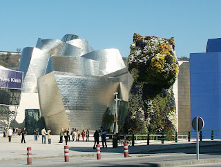
Puppy


This sculpture is simply named "Puppy" and I chose it because it's a fascinating piece. I love it because it's a living sculpture, in that the flowers that cover it continue to bloom and grow, allowing the structure to change shape and color with nature. It has a permanent home in front of the Guggenheim and is considered a landmark of the area.

Jeff Koons Cracked Egg

I love the creativity and imagination that Jeff had when making this piece; although, the background is my favorite. According to a New York Times magazine, Jeff Koons writes that this particular work of art is one of his favorites that he made in college. It was prepared on a 80 square foot canvas, that stood up to ten feet tall and took him about four to five months to make before it was sculpted. When Jeff finally finished this project, the man hanging it up for the public, slipped off the ladder and dropped the painting. Jeff then started over a few weeks later and realized he didn't have the patience anymore for it so he quit. After talking to his professor, he finished the piece for the second time about a year later and put it out for display. In 2003 Jess sold his "Cracked Egg" for over $500,000 in London. I enjoyed reading about this project and seeing all of his different pieces.

Blue Hanging Heart


The piece that I chose was the blue hanging heart. This sculpture was made in 2006 out of stainless steel and then painted with a transparent color coating paint which is why the reflection is able to be seen. The heart is 9 feet long and the detail on it is so beautiful. I chose this sculpture because it reminded me of the "heart of the ocean" necklace from the movie Titanic. The detail of the bow on top is what I love about this sculpture and the way it hangs down from the ceiling it is astonishing. The heart has so much detail along with the reflective paint which adds dimension to the sculpture. This heart was also created in 4 more unique colors and designs.

Jeff Koons Heart

I chose this Jeff Koons heart sculpture because I enjoyed all of his balloon sculptures and this one seems to use the same techniques but to make a different look. This heart sculpture is most interesting to me because it looks so realistic to a heart shaped present or candy wrapped in metallic wrapping. It's so realistic it looks like someone could walk up to it and pull off the wrapping to reveal the inside treat.

Popeye Jeff Koons


I choose the "Popeye" by Jeff Koons because I like how Koons took an iconic character and added his own modern twist on it. I can relate to this because this is what we are doing in class currently. I like how Jeff Koons made the sculpture on a large scale, I believe this enhances the sculpture's look. I also like that he used metallic colors. The metallic color scheme adds to the contemporary style of his work. 

Wednesday, September 23, 2015

Vik Muniz

I really liked this piece, it reminded me of all the ones we saw in the video about him and the ones he made out of garbage. I chose this photo of it because it shows it from the side so you can see how it was all laid out. All the websites this was posted on were all typed in Spanish so i couldn't really find out the name of this piece, but from what i attempted to read, this was made for the opening of novel 'Passione'. I liked a lot of other works i saw by him too, there were ones made of diamonds which was awesome. If i'm wealthy enough one day i'm going to hire him to make a diamond portrait of myself.

Vik Muniz


White Rose (from the Monad Series)
2003

I chose Vik Muniz's "White Rose". I love the empty space used in order to create depth in the image of the rose, where in actuality there is none, Upon first inspection, I thought the image was put together using hot peppers, but upon closer inspection discovered that the clusters of color were actually comprised of bugs. This image is visually stimulating with a sinister undertone that I really liked. 

Vik Muniz

I chose "Hummingbird" 2012 by Vik Muniz. The medium is scrap metal, and the hummingbird is one of the repurposed scrap metal pieces part of a series of animals. The gold metal makes each piece pop and stand out to the audience. I chose this series and more specifically this animal because the contrast of scrap metal to such a beautiful animal is great. Muniz was really able to transform the garbage to beautiful art.

Vik Muniz


This is the picture Vik Muniz recreated of the Famous painting by Vincent Van Gough, Starry Night. I was intrigued by the color palate Vik Muniz used, this painting stands out to me. I find it very interesting that he made this out of garbage. Vik Muniz's creative skills are clearly one of a kind.

Album and Postcards from Nowhere


These two images above, New Kitten and Shanghai are a sneak peak of Vik Muniz's new series, titled "Album and Postcards from Nowhere," of shredded collage work for his show from January 16 to March 4 in Hong Kong. The album consists of cityscapes or some cheerful postcard imagery where, similar to his work at the junkyard, the pictures are a collage of unusual materials (in this case, shredded vintage photographs and postcards).
These two images were my favorite that he did from the album; I love the attention to detail he uses to recreate the city skyline, and the cat in the other collage. He did a marvelous and impressive job creating something as beautiful as these two pieces with just old pieces of postcards. 

Milan, The Last Supper (1997)

This work is Vik Muniz's version of Leonardo da Vinci's The Last Supper (1498). Although Muniz's medium is technically photography, he used chocolate syrup to create the image we see. The glossy appearance of the syrup makes viewers wonder whether it is the photography, the background, or the syrup itself in certain areas of the picture. Vik Muniz is multi-talented in that he is an artist with many different mediums, ending in photography mostly, as well as an illusionist. His works play with the eyes of the viewers and often trick and deceive them.

Fuji from the Sea of Satta


I picked Vik Muniz's pictures of paper that he did in 2009. He created this piece my layering paper over each other creating a beautiful popping affect. I also thought it related to the projects we are working on in class using paper as the medium.

PB&J Mona Lisa


Vik Muniz took the Mona Lisa by Leonardo Di Vinci and created his own work of art, he used peanut butter and jelly to develop two separate portraits of the Mona Lisa. Looking at the two different elements that Muniz used side by side really brings out two unique perspectives of the Mona Lisa. In my opinion, the peanut butter portrait shows a lighter and more detailed view, while the jelly shows a darker and more mysterious side.

Sugar Children


I chose a picture from Vik Muniz's "Sugar Children" series which consists of photographs of drawings he made of sugar. This piece of art work would have to be my favorite because the children in the photographs had parents and grandparents that worked on the sugar plantation on the island of Saint Kitts which is very significant and personal to these children's lives. These pieces amazes me because sugar is so small and the amount of time and patience it must have taken to create an entire series is mind blowing. 


BEACH - Vic Muniz

Theresa Spath
I chose the picture Beach by Vic Muniz. I think this exhibit Postcards From Nowhere is really cool because Muniz took old postcards and made them into something new. I have always been fascinated by old letters and postcards and I think that these ones are portrayed in a really unique way. I chose this picture from the exhibit because I love to travel and I love to be at the beach. There is so much going on in the picture and I could look at it for hours and still find something i hadn't noticed in it before.

Tuesday, September 22, 2015

Sandcastle #10, Series of Sandcastles


Vik Muniz. Sandcastle #10, Series of Sandcastles. Photograph. 2014.


I choose this piece because I found the light sketch of the castle against the dark, textured background interesting. While the image is appealing, it wasn’t until I did further research on the piece that I was amazed. This image is actually a magnified photograph of a single grain of sand in which Vik Muniz, with help of Marcelo Coelho, engraved his sketch. The process in which they did this is extremely interesting to me as Muniz used the camera lucida, which is a 19th century device used before photography was invented to sketch objects placed in front of you. With this sketch, Marcelo Coelho used a  Focused Ion Beam to etch the sketch into the actual grain of sand. The magnified picture was then taken and printed as a 71x86 9/10 inch photograph.

MONA LISA VIK MUNIZ


This is called the "Mona Lisa, after Leornardo da Vinci"  from Vik Muniz's Gordian Puzzles collection. I chose this Vik Muniz piece because I like how Muniz took a master piece by a world renowned artist and put his own twist on it. What I like most about Vik Muniz is that he takes simple things, in this case puzzle pieces, and makes them into extraordinary masterpieces. I believe the simplicity of the puzzle pieces adds an ironic twist to the Mona Lisa which known for having hidden meaning.I believe the puzzle pieces could be ironic because its a way of putting together the pieces of the hidden message of the Mona Lisa. I also like how the puzzle pieces adds depths to the Mona Lisa. 

-Karissa Scialpi 
The Vik Muiz piece I chose was from the Album: Sonora, 2014. I chose this piece because I really enjoy using a collage of many different photos to create an entirely new image. I think it fun, innovative and creative. I enjoyed zooming in and looking at the different images used and found it interesting that the main person in the picture is many different images layered together, not an original person from a picture like i initially thought it was. I also enjoy that the white background is made from what I assume to be the rest of the pictures and papers used because you can see images and where pictures were cut out of them if you look closely.

-Megan McCarthy
The Vik Muniz piece that I chose is a part of his Earthworks series called Faucet. What I like the most about this series is, as with most of Vik's work, the impermanence of it. When he has finished a project, all that remains is his photograph of it. I also like the fact that this piece is on such a massive scale, and I am impressed with the amount of work that went into it.

Caryl Fisher

Vic Muniz Art

I enjoy this artist because of the patience and perfection he puts in his work. If you look closely you can notice that Vic uses small tiles or "dot" like objects to complete his picture. This type of art requires a lot of time and heart put into it to make it look like an actual human being. Also, I enjoy that in the face of this person you can see the emotion he is feeling. In art this is very difficult, especially when using supplies other than pencil. I enjoy Vic's artwork and the details he puts in his work.

Medusa Plate

The piece i chose by Vik Muniz is the Medusa Plate. What i like about this piece of art is that he used something so simple to create it.  

Elizabeth Tayor in Diamonds (2004)


The art that I chose from Vik Muniz was a piece of work that he did with diamonds. This portrait is of the famous Elizabeth Taylor. He used more than 550 carats of diamonds!! This portrait is truly amazing. To be famous and successful is one thing but to have an artist take your picture and then make it out of diamonds is a whole other star quality. The face looks so intense and the shading is just right. Also it sparkles in the light which gives the painting a different and unique quality. If you look closely you can see all the separate diamonds that were used. This piece stood out to me because Vik took items that no one would think could make a portrait and he pulled of what looks like a miracle. The way that Muniz uses unusual objects to make his paintings and pictures of art is why he is such a unique artist.

Monday, September 21, 2015

Double Mona Lisa

This piece is called Double Mona Lisa by Vik Muniz. The greatest part about this piece is that it's made out of peanut butter and jelly! It love how he turned a classic and well-known piece of art into this. It's a clever and unconventional interpretation of Leonardo da Vinci's Mona Lisa.

Sunday, September 20, 2015

Vik Muniz

This is a work by Vik Muniz where he recreated Van Gough's famous Starry Night. The thing that stood out the most to me in this piece of art is that it is incredibly detailed and made exclusively from shreds of magazines and if you zoom in you can see that some of strips include pictures or words from the magazines. Vik Muniz also made this out of garbage like he did with his works of art in Wasteland.

Friday, September 18, 2015

Vik Muniz

I think after looking over most of Vik Muniz's art beside wasteland, postcards from nowhere have to be my favorite.
 
This is one of his many art works from this collection, this is the Forbidden  City. This picture has the same affect many places and city have. In the distance this picture is beautiful and is one combined entity, but the closer you get messier the picture become the more separated it is. I feel like this is a relatable concept. 

Wednesday, September 16, 2015

Anamorphic Drawing

My anamorphic drawing is of a can of Red Bull. My biggest challenge was determining how extreme to make the difference is size of the top of the can compared to the bottom. The shading of the two tones of the can made the item more recognizable in my opinion and that made the drawing look more finished and complete. Overall I'm happy with my work because after many trial-and-errors the can seems to fit the criteria of an anamorphic drawing.

For my anamorphic drawing I drew a ball bouncing off the page.

Let's hope this anamorphic drawing isn't the same as my grade


anamorphic drawing, Iphone


The first photo is my drawing from a different angle, and the second is a normal view of the paper. I found this more difficult than expected but i think mine came out alright. I just need to work on proportion more. Overall i enjoy this style, anamorphic, and i can appreciate other peoples drawings. It is fun to look at something and have it look totally different from another angle.